
Introducing Planner v2
Update: Planner v2 is now the default for all new orders!
Building the hyperpaper planner since late 2021 has been quite a ride. The response from customers has vastly exceeded my expectations, and I'm extremely grateful for all the feedback and customer suggestions that have helped make it better over time.
With that said, there have still been some gaps and common requests that haven't been easy to add with the usual incremental feature additions. A few months ago I stepped back and started to rework the planner to address them while keeping the things that people love about it:
- Easy to navigate, especially between pages related to the current week or month
- Customizable to your needs and workflow
- Adaptable to your device
Here's a look at what's new!
Sunday or Monday week start
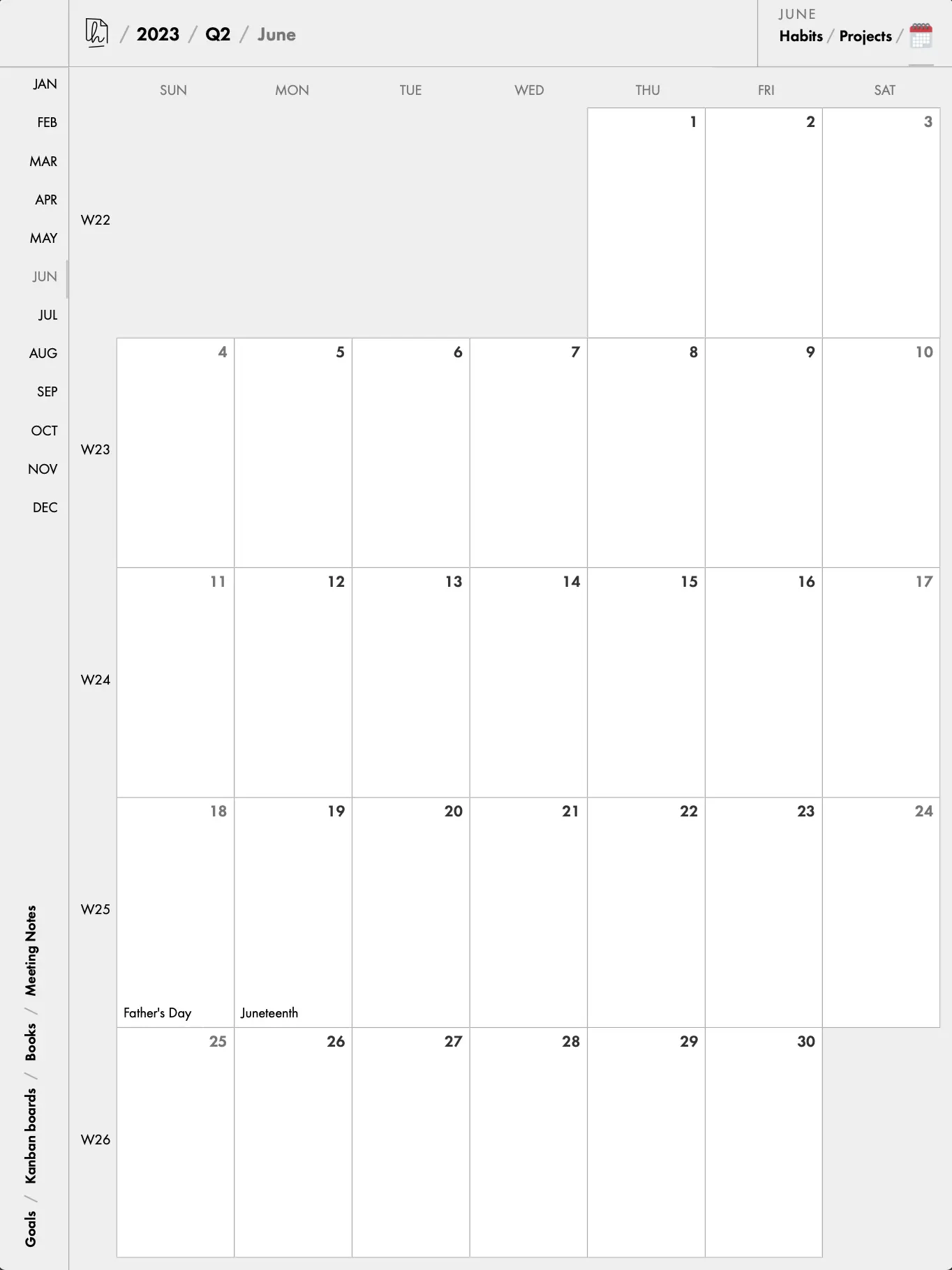
From the very beginning, the most common request has been to start weeks on Sunday. The planner is built using date libraries that use ISO 8601 weeks, which always start on Monday, so supporting a different week start means updating every place that checks a day's week and using the setting to resolve it.
Now it's done! You can choose Sunday or Monday as the week start. This is reflected in the yearly calendar, quarterly pages, month calendar, and any weekly collections you've created (with one exception, see the next section).
Weekly flexibility and default planning view
Since the first version of the planner, there has always been a "Weekly tasks" collection. While that seems to work for most people, it's a little too prescriptive for a planner that aims to be mouldable to anyone's workflow. So now you can name your default weekly collection whatever you like (or disable it completely).
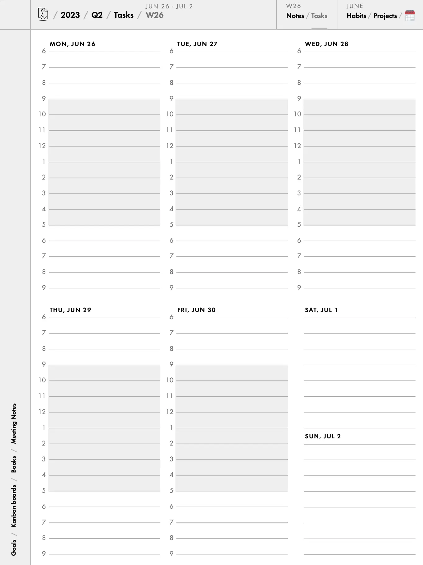
In addition, there is a new default weekly view. It's called the Weekly Plan and gives you a bird's eye view of every waking hour in your week. It's similar to the weekly view you're probably familiar with in Google Calendar, but adapted to fit portrait mode so you don't have to rotate your tablet. And of course it shows the working hours and holidays you have set for the rest of the planner.
Note– to give enough space for each weekday, Sat/Sun are shown together in this view. That means this is the only part of the planner that doesn't respect the new optional Sunday week start setting.
Navigation sidebar
Another common request has been to add padding on the left or right of each page for the reMarkable (or Supernote) tool menus. I have always been hesitant to do this because it reduces the available space on the screen by a noticeable amount. However, it's been a consistent enough request, and I have done enough menu toggling myself, to prompt a rethink.
Now every page in the planner (except the first one) has a sidebar on the left– or on the right if you're left-handed. Not only does it allow you to keep any left menus permanently open, but the collection links that used to be at the bottom of the Day pages are now in this sidebar as well. No more accidentally triggering those links with your palm!
Refreshed design and miscellaneous
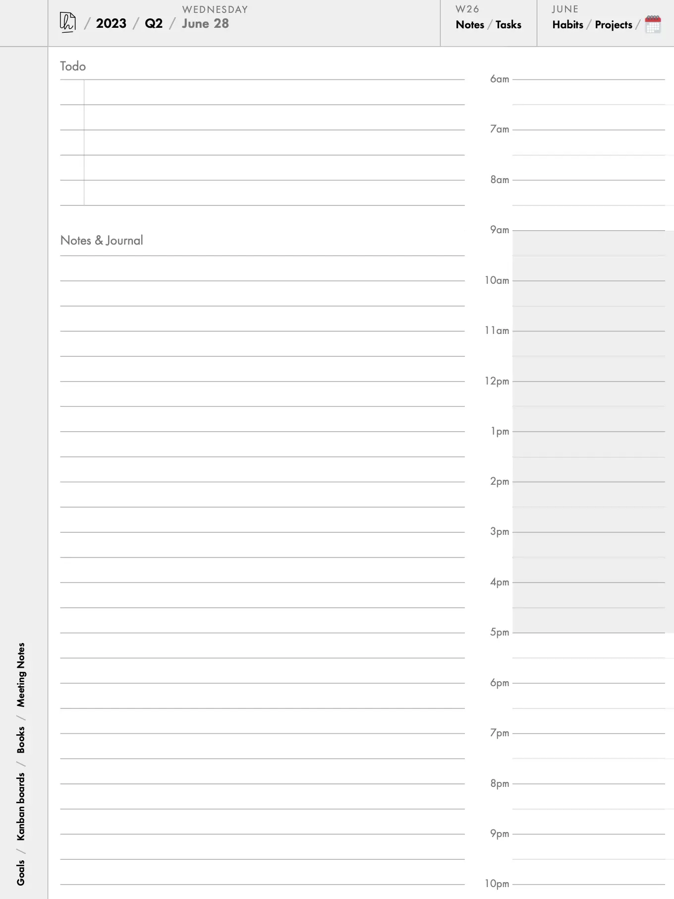
While the overall layout of the planner is similar to how it was before, there are little design and typography improvements throughout (Futura 😍). Links are now consistently black, and supporting text is grey, to make it easier to determine what is tappable.
There are various other updates; I've done my best to document them in the planner changelog.
If you're an existing customer interested in an updated pdf with the v2 changes, please get in touch via email. I'm hoping to make it the default for all orders within the next month.